
The Information of Architecture
AUSTRALIAN INSTITUTE OF ARCHITECTS • UX, UI
Acumen is the Australian Institute of Architects’ (AIA) practice advisory service, providing working architects with current advisory and regulatory material. It’s a wealth of valuable information.
The problem? Acumen’s online service was woefully under-utilised thanks to a dated and poorly structured web portal. It was so unloved that some architects were still using the huge red, blue and yellow binders that historically housed this information in the pre-digital era. AIA approached Fusion to rethink how this resource could realise its online potential.
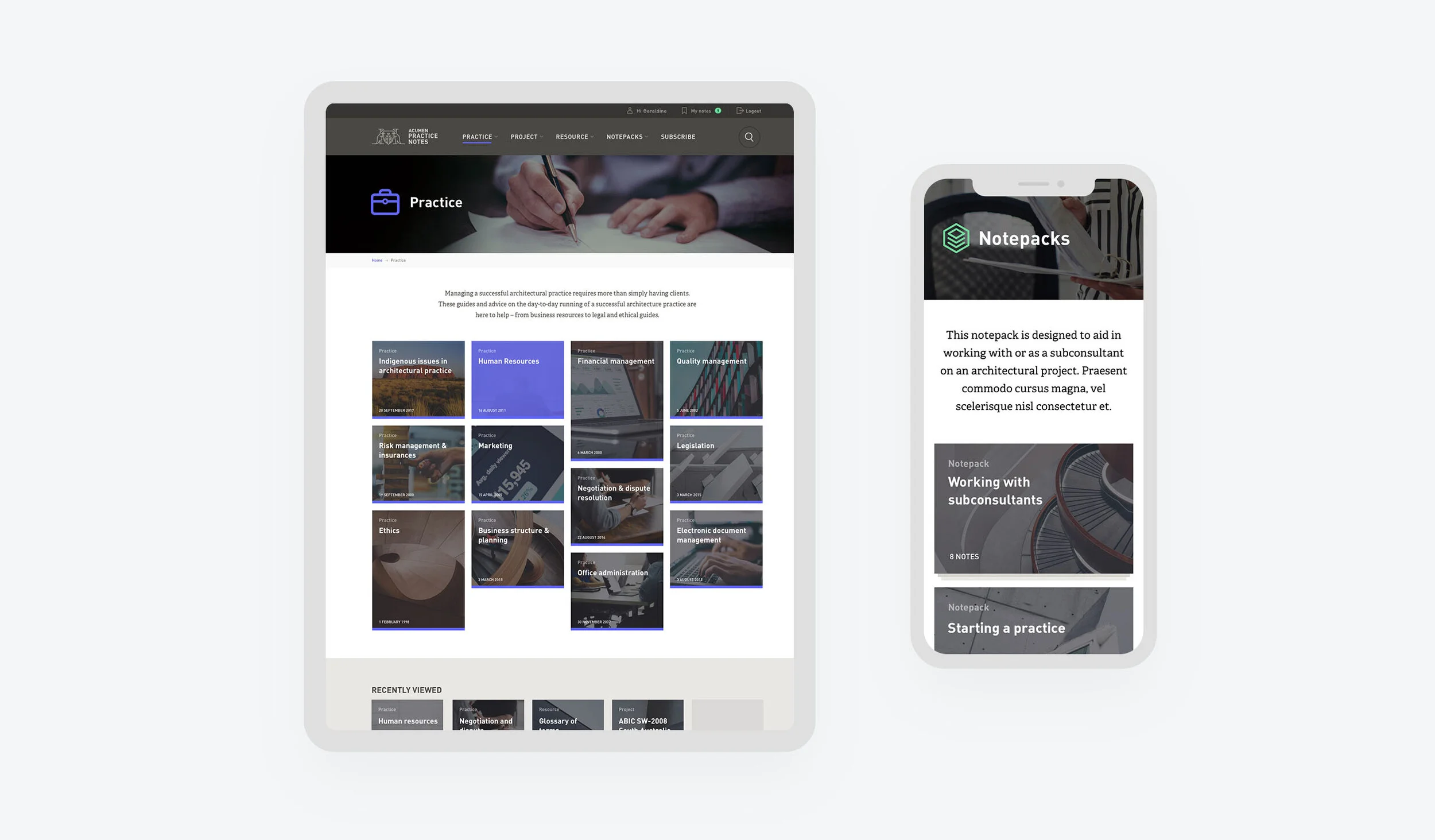
I was responsible for developing the portal’s information architecture, structure, interface and visual tone. We prioritised search, clear categorisation, and common-sense navigation to make it simple for users to find relevant practice notes, access references, and send comments to editors. The concept of Notepacks was also introduced – collections of practice notes from a variety of categories that are centred around a common theme.
Visually, a neutral, stoic palette was favoured to keep the spotlight on the content. Article layouts were optimised with large body text sizes to make for a comfortable “lean-back” reading experience, while an increased focus on imagery helped to breathe life into text-heavy content. We took advantage of the digital format by using tooltips to show instant terminology definitions, and made it easy for readers to view references and footnotes without losing their place in the text.
In a nod to those old printed binders that would soon be gathering dust, we used bold accents of red, blue and yellow to differentiate the different subject categories. This meant that even though the portal was a brand new experience, readers could jump right into the content via familiar visual cues.

